

 24 April, 2020


Policy discourse in India has steered towards opening the economy in a phased manner to combat the mounting economic distress caused by the Covid-19 lockdown. In this post, Puppala, Gupta, and Sekhri describe a web-based dynamic dashboard that they have developed, which can facilitate a policy of staggered relaxing of lockdowns with precautionary measures, by enabling the identification of high, moderate, and low-risk areas in real time.
The precipitous rise in the number of Covid-19 positive cases globally and the accompanying death toll has prompted many governments to take action to slow the spread. Various measures such as social distancing, widespread screening, contact tracing, isolating, and quarantining have been used to address this global public health emergency. South Asian countries have resorted to total lockdowns. These lockdowns have resulted in large-scale unemployment and reports indicate starvation is on the rise. More than 70% of the population in many of these countries is employed in the informal sector. While lockdowns are effective in reducing the transmission rates, without safety nets and unemployment insurance, the poor and ultra-poor populations are facing acute economic distress.
In India, death rates are increasing, and a large swath of migrant workers are trying to return to their home states where they are being isolated. A lockdown for 21 days has now been extended for 19 more days until 3 May 2020. The lockdown has so far been effective at keeping the Covid-19 spread at bay. Policy discourse has steered towards opening the economy in a phased manner to combat the mounting economic distress. Policymakers are weighing in on several scenarios and options, and ramping up preparation to meet public health challenges that will arise as the economy is reopened.
Using data to compute criticality scores of districts in real time
In order to facilitate this process, we have developed a web-enabled dashboard that can receive online data as an input in real time and compute a ‘criticality’ or ‘risk score’ for each district of India. This is done using not only the data on daily and cumulative positive cases and mortality, but also other important attributes such as population density, hospitals and allied services, and availability of home delivery for vital services. Our dashboard uses a multi-criteria decision analysis tool: ‘Technique for Order of Preference by Similarity to Ideal Solution’ (TOPSIS). The underlying model receives weights for the importance of these attributes based on expert opinions and media reports. The TOPSIS analysis then uses these weights as inputs and finds optimal weights. These optimal weights are utilised to output the criticality index.
The tool can cluster the districts based on the computed criticality index. Some single criterion-based maps are generated as well (such as using death rates, clusters of positive cases, and total cumulative positive cases). But we underscore the importance of taking multiple attributes into account. For example, Kerala has 394 positive cases, 147 currently active, 245 recovered, and 2 deaths; however, Karnataka has 359 positive cases but 13 deaths. Punjab, on the other hand has 197 positive cases but 14 deaths. This example illustrates that we need to factor in multiple attributes. Our tool can expand the expert weights that are fed to it, if so desired. It can also take other attributes into account. In subsequent days, we will augment this with the tool’s efficacy data as well. In further extensions, data for the next 90 days, will be gathered and input to this dashboard to develop criticality indices of districts.
Policymakers can use this in the decision-making process with the acknowledgement that the recommendations are predicated on infection-testing data and reported mortality rates (if those have measurement errors, the tool takes them at face value). The tool’s recommendation for the districts deemed high-risk (with high criticality score) would be to keep them closed, while for low-risk districts, it would be to open. For moderate-risk districts, the tool would recommend opening with precautionary steps. Wide-scale testing, using masks, contact tracing, screening, and checking the inflow of freight and people are the measures that public health officials and policymakers might want to employ. The tool can provide the scenario and update the district classification in real time. So, a worsening situation can be visualised without lags or delays. The following figure provides an illustrative example using data from various reports issued by the Government of India.
Figure 1. An illustration of the output from the Dashboard
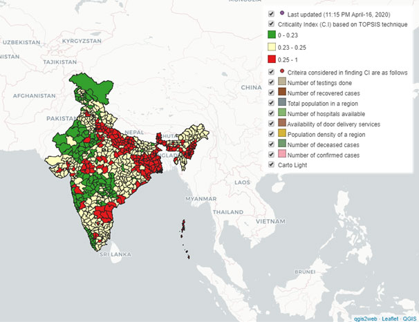
Note: The interactive Dashboard can be accessed at: https://harishpuppala43.github.io/citicalitymap/. More details are available in Puppala et al. (2020).
Further Reading
- Puppala, H, R Gupta and S Sekhri (2020), ‘A Dynamic Decision Tool to Manage COVID-19 Risk Mitigation Efforts’.

By: Anil Agrawal 25 April, 2020
Awesome study! Very useful. Would like to see more such studies.