

 10 February, 2017


While inequality has received a great deal of attention in the public debate in recent times, the poor quality of data available on this issue is a constraint. Based on a recently-compiled database of the World Bank, this column presents the trend for within-country inequality for the average country.
Inequality has featured prominently in the public debate in recent times. Media outlets highlight the apparent surge in the incomes of the richest, many books have been written on this issue, and numerous academic studies have attempted to assess the nature and magnitude of inequality over time. Most studies of inequality focus on the extent of inequality within a country; this makes sense since most policies operate at this level, too. Despite the attention this issue has received, it has been constrained by the quality of data on inequality. Household surveys collected by national authorities around the world are the most readily available source of data on inequality. However, compiling and harmonising household surveys from different countries, is extremely difficult as they are not always collected consistently or frequently enough. It is also well-known that household surveys often fail to capture the top tail of the distribution, as we discuss in more detail here.
Bearing in mind these caveats, for the World Bank’s latest flagship report Poverty and Shared Prosperity report 2016, an effort was made to compile the most recent data for as many countries as possible. This database was constructed primarily from PovcalNet, the World Bank’s online repository of data on poverty and inequality, but also from the All the Gini’s database compiled by Branko Milanovic. Not all countries have data for every year, so the annual data were grouped into five-year intervals from 1988 to 2013. The resulting database contains data on Gini indices from more than 600 household surveys from 162 countries, representing between 71% and 91% of the world population (depending on the year).
Figure 1. Average within-country inequality, 1988-2013
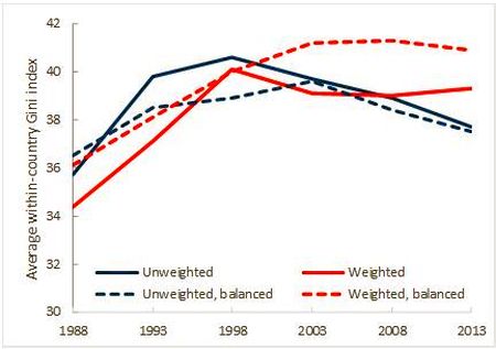
Source: Fig. 4.6 in World Bank, Poverty and Shared Prosperity report 2016.
Note: Solid lines show the trend in the average within-country Gini index with and without population weights in the full sample (an average 109 countries per benchmark year). Dashed lines refer to the balanced sample, that is, using only the set of 41 countries on which data are available in every benchmark year.
The solid blue line in Figure 1 shows the average Gini index for all countries for which data are available in a particular year. This average allows us to capture how countries have fared over time in terms of reducing inequality. The analysis treats China and Honduras the same, regardless of the fact that the population of China is much larger. This unweighted average Gini index increased during the 1990s by around five points, from 36 in 1988 to 41 10 years later and declined thereafter, reaching 38 in 2013.
One complication in the analysis is that not every country has a household survey every five years, so the sample of countries changes from one year to the next. The dotted blue line repeats the analysis but using the same set of 41 countries every year (representing 46% of the world population in 2013). The trend is very similar.
We might also be interested in how within-country inequality changed for the average person in the world. The population-weighted average (solid red line) captures exactly that – it also rose sharply between 1988 and 1998 and has declined slightly since then, but remains at a higher level than 25 years ago. Looking at the balanced sample, the typical person lived in a country where inequality increased until around 2008 and has since plateaued off.
The levels and trends in average inequality are quite different across regions, although the most recent decline is broad based. Figure 2 shows the unweighted average Gini index across seven regions. Within-country inequality tends to be higher in developing countries than in developed countries, the latter grouped in this analysis as industrialised countries (a subset of high-income countries).
Figure 2. Trends in the average Gini, by region, 1988-2013
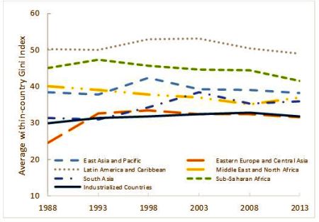
Source: Fig. 4.6 in World Bank, Poverty and Shared Prosperity report 2016.
Note: The lines show the average within-country Gini index by region. It is the sample average in the full sample without weighting countries by population.
The highest levels of inequality are observed in Latin America and the Caribbean, although this region also stands out as being successful in narrowing inequality in the last 10 to 15 years. The average Gini for Sub-Saharan Africa has declined steadily since the early 1990s, but continues to be the second highest among all regions, and hides a lot of within-region variability (as well as potential issues with survey comparability). In Eastern Europe and Central Asia, average inequality rose sharply after the fall of the Berlin Wall, but has since been declining. Similarly, inequality rose sharply during the transition to a market economy in some East Asian countries. The average industrialised country experienced an increase in the Gini index from 30 in 1988 to 33 in 2008. During 2008-13, average inequality appears to have fallen in all regions except the Middle East and North Africa, where data are limited, and South Asia.
This is the first of a three-part series on recent trends in national inequality, on the World Bank’s Let’s Talk Development blog. This column has presented the trend for within-country inequality for the average country. Providing a simple explanation for these global and regional trends is particularly challenging because countries within a region may exhibit distinctive trends. The next part looks directly at the changes in inequality at the country-level, and the third one pays more attention to methodological challenges.
This column originally appeared on the World Bank’s Let’s Talk Development blog on October 17, 2016: http://blogs.worldbank.org/developmenttalk/inequality-typical-country-last-25-years-strong-increase-followed-recent-decline.
Comments will be held for moderation. Your contact information will not be made public.